Monday, 22 January 2018
06:00 PM
Exploring handwritten digit classification: a tidy analysis of the MNIST dataset [Variance Explained] 06:00 PM, Monday, 22 January 2018 06:40 PM, Tuesday, 24 December 2019
In a recent post, I offered a definition of the distinction between data science and machine learning: that data science is focused on extracting insights, while machine learning is interested in making predictions. I also noted that the two fields greatly overlap:
I use both machine learning and data science in my work: I might fit a model on Stack Overflow traffic data to determine which users are likely to be looking for a job (machine learning), but then construct summaries and visualizations that examine why the model works (data science). This is an important way to discover flaws in your model, and to combat algorithmic bias. This is one reason that data scientists are often responsible for developing machine learning components of a product.
I’d like to further explore how data science and machine learning complement each other, by demonstrating how I would use data science to approach a problem of image classification. We’ll work with a classic machine learning challenge: the MNIST digit database.
The challenge is to classify a handwritten digit based on a 28-by-28 black and white image. MNIST is often credited as one of the first datasets to prove the effectiveness of neural networks.
In a series of posts, I’ll be training classifiers to recognize digits from images, while using data exploration and visualization to build our intuitions about why each method works or doesn’t. Like most of my posts I’ll be analyzing the data through tidy principles, particularly using the dplyr, tidyr and ggplot2 packages. In this first post we’ll focus on exploratory data analysis, to show how you can better understand your data before you start training classification algorithms or measuring accuracy. This will help when we’re choosing a model or transforming our features.
Preprocessing
The default MNIST dataset is somewhat inconveniently formatted,
but Joseph
Redmon has helpfully created a CSV-formatted version. We can
download it with the readr package.
library(readr)
library(dplyr)

mnist_raw <- read_csv("https://pjreddie.com/media/files/mnist_train.csv", col_names = FALSE)mnist_raw[1:10, 1:10]## # A tibble: 10 x 10
## X1 X2 X3 X4 X5 X6 X7 X8 X9 X10
## <int> <int> <int> <int> <int> <int> <int> <int> <int> <int>
## 1 5 0 0 0 0 0 0 0 0 0
## 2 0 0 0 0 0 0 0 0 0 0
## 3 4 0 0 0 0 0 0 0 0 0
## 4 1 0 0 0 0 0 0 0 0 0
## 5 9 0 0 0 0 0 0 0 0 0
## 6 2 0 0 0 0 0 0 0 0 0
## 7 1 0 0 0 0 0 0 0 0 0
## 8 3 0 0 0 0 0 0 0 0 0
## 9 1 0 0 0 0 0 0 0 0 0
## 10 4 0 0 0 0 0 0 0 0 0This dataset contains one row for each of the 60000 training instances, and one column for each of the 784 pixels in a 28 x 28 image. The data as downloaded doesn’t have column labels, but are arranged as “row 1 column 1, row 1 column 2, row 1 column 3…” and so on). This is a useful enough representation for machine learning. But as Jenny Bryan often discusses, we shouldn’t feel constricted by our current representation of the data, and for exploratory analysis we may want to make a few changes.
- We’d like to represent it as one-row-per-pixel-per-instance. It would be challenging to visualize this default data as images, but it becomes easier once we consider each pixel an “observation”.
- We’d like custom features that have meaning within the problem For instance, we don’t just have 784 arbitrary features; we have 28 rows and 28 columns. So rather than having labels like “X2” and “X3”, we’d like to keep track of variables for x and y (as coordinate positions of the images).
- We’d like to explore a subset first. While you’re first exploring data, you don’t need your full complement of training examples, since working with a subset lets you iterate quickly and create proof of concepts while saving computational time.
If your data's huge, analyze a small subset first to check approach. Like navigating the route on a bike before trying your 18-wheeler truck
— David Robinson (@drob) September 4, 2015
With that in mind, we’ll gather the data, do some arithmetic to keep track of x and y within an image, and keep only the first 10,000 training instances.
library(tidyr)

pixels_gathered <- mnist_raw %>%
  head(10000) %>%
  rename(label = X1) %>%
  mutate(instance = row_number()) %>%
  gather(pixel, value, -label, -instance) %>%
  tidyr::extract(pixel, "pixel", "(\\d+)", convert = TRUE) %>%
  mutate(pixel = pixel - 2,
         x = pixel %% 28,
         y = 28 - pixel %/% 28)

pixels_gathered
## # A tibble: 7,840,000 x 6
## label instance value pixel x y
## <int> <int> <int> <dbl> <dbl> <dbl>
## 1 5 1 0 0 0 28.0
## 2 0 2 0 0 0 28.0
## 3 4 3 0 0 0 28.0
## 4 1 4 0 0 0 28.0
## 5 9 5 0 0 0 28.0
## 6 2 6 0 0 0 28.0
## 7 1 7 0 0 0 28.0
## 8 3 8 0 0 0 28.0
## 9 1 9 0 0 0 28.0
## 10 4 10 0 0 0 28.0
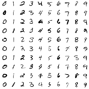
## # ... with 7,839,990 more rowsWe now have one row for each pixel in each image. This is a useful format because it lets us visualize the data along the way. For example, we can visualize the first 12 instances with a couple lines of ggplot2.
library(ggplot2)
theme_set(theme_light())

pixels_gathered %>%
  filter(instance <= 12) %>%
  ggplot(aes(x, y, fill = value)) +
  geom_tile() +
  facet_wrap(~ instance + label)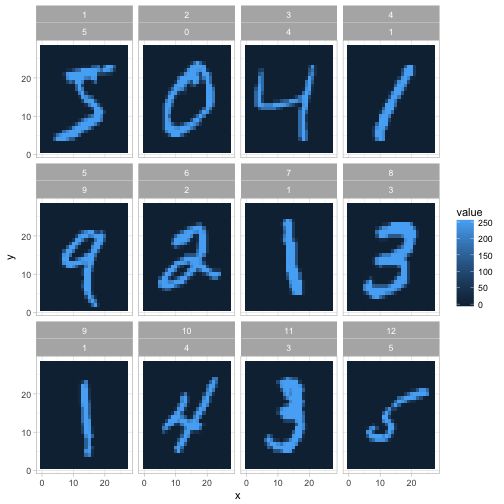
We’ll still often return to the one-row-per-instance format (especially once we start training classifiers in future posts), but this is a fast way to understand and appreciate how the data and the problem is structured. In the rest of this post we’ll also polish this kind of graph (like making it black and white rather than a scale of blues).
Exploring pixel data
Let’s get more comfortable with the data. From the legend above, it looks like 0 represents blank space (like the edges of the image), and a maximum around 255 represents the darkest points of the image. Values in between may represent different shades of “gray”.
How much gray is there in the set of images?
ggplot(pixels_gathered, aes(value)) +
geom_histogram()![]()
Most pixels in the dataset are completely white, along with another set of pixels that are completely dark, with relatively few in between. If we were working with black-and-white photographs (like of faces or landscapes), we might have seen a lot more variety. This gives us a hint for later feature engineering steps: if we wanted to, we could probably replace each pixel with a binary 0 or 1 with very little loss of information.
I’m interested in how much variability there is within
each digit label. Do all 3s look like each other, and what is the
“most typical” example of a 6? To answer this, we can
find the mean value for each position within each label,
using dplyr’s group_by and
summarize.
pixel_summary <- pixels_gathered %>%
  group_by(x, y, label) %>%
  summarize(mean_value = mean(value)) %>%
  ungroup()

pixel_summary
## # A tibble: 7,840 x 4
## x y label mean_value
## <dbl> <dbl> <int> <dbl>
## 1 0 1.00 0 0
## 2 0 1.00 1 0
## 3 0 1.00 2 0
## 4 0 1.00 3 0
## 5 0 1.00 4 0
## 6 0 1.00 5 0
## 7 0 1.00 6 0
## 8 0 1.00 7 0
## 9 0 1.00 8 0
## 10 0 1.00 9 0
## # ... with 7,830 more rowsWe visualize these average digits as ten separate facets.
library(ggplot2)

pixel_summary %>%
  ggplot(aes(x, y, fill = mean_value)) +
  geom_tile() +
  scale_fill_gradient2(low = "white", high = "black", mid = "gray", midpoint = 127.5) +
  facet_wrap(~ label, nrow = 2) +
  labs(title = "Average value of each pixel in 10 MNIST digits",
       fill = "Average value") +
theme_void()![]()
These averaged images are called centroids. We’re treating each image as a 784-dimensional point (28 by 28), and then taking the average of all points in each dimension individually. One elementary machine learning method, nearest centroid classifier, would ask for each image which of these centroids it comes closest to.
Already we have some suspicions about which digits might be easier to separate. Distinguishing 0 and 1 looks pretty straightforward: you could pick a few pixels at the center (always dark in 1 but not 0), or at the left and right edges (often dark in 0 but not 1), and you’d have a pretty great classifier. Pairs like 4/9, or 3/8, have a lot more overlap and will be a more challenging problem.
Again, one of the aspects I like about the tidy approach is that at all stages of your analysis, your data is in a convenient form for visualization, especially a faceted graph like this one. In its original form (one-row-per-instance) we’d need to do a bit of transformation before we could plot it as images.
Atypical instances
So far, this machine learning problem might seem a bit easy: we have some very “typical” versions of each digit. But one of the reasons classification can be challenging is that some digits will fall widely outside the norm. It’s useful to explore atypical cases, since it could help us understand why the method fails and help us choose a method and engineer features.
In this case, we could consider the Euclidean distance (square root of the sum of squares) of each image to its label’s centroid.
pixels_joined <- pixels_gathered %>%
  inner_join(pixel_summary, by = c("label", "x", "y"))

image_distances <- pixels_joined %>%
  group_by(label, instance) %>%
  summarize(euclidean_distance = sqrt(mean((value - mean_value) ^ 2)))

image_distances
## # A tibble: 10,000 x 3
## # Groups: label [?]
## label instance euclidean_distance
## <int> <int> <dbl>
## 1 0 2 47.2
## 2 0 22 53.1
## 3 0 35 69.4
## 4 0 38 59.5
## 5 0 52 61.4
## 6 0 57 65.7
## 7 0 64 68.1
## 8 0 69 81.1
## 9 0 70 65.2
## 10 0 76 59.6
## # ... with 9,990 more rowsMeasured this way, which digits have more variability on average?
ggplot(image_distances, aes(factor(label), euclidean_distance)) +
  geom_boxplot() +
  labs(x = "Digit",
       y = "Euclidean distance to the digit centroid")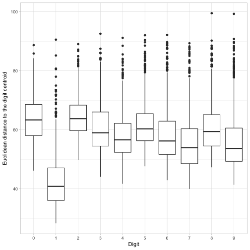
It looks like 1s have especially low distances to their centroid: for the most part there’s not a ton of variability in how people draw that digit. It looks like the most variability by this measure are in 0s and 2s. But every digit has at least a few cases with an unusually large distance from their centroid. I wonder what those look like?
To discover this, we can visualize the six digit instances that had the least resemblance to their central digit.
worst_instances <- image_distances %>%
  top_n(6, euclidean_distance) %>%
  mutate(number = rank(-euclidean_distance))

pixels_gathered %>%
  inner_join(worst_instances, by = c("label", "instance")) %>%
  ggplot(aes(x, y, fill = value)) +
  geom_tile(show.legend = FALSE) +
  scale_fill_gradient2(low = "white", high = "black", mid = "gray", midpoint = 127.5) +
  facet_grid(label ~ number) +
  labs(title = "Least typical digits",
       subtitle = "The 6 digits within each label that had the greatest distance to the centroid") +
  theme_void() +
  theme(strip.text = element_blank())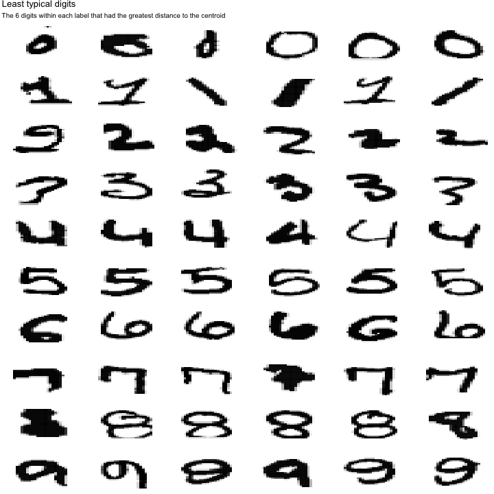
This is a useful way to understand what kinds of problems the data could have. For instance, while most 1s looked the same, they could be drawn diagonally, or with a flat line and a flag on top. A 7 could be drawn with a bar in the middle. (And what is up with that 9 on the lower left?)
This also gives us a realistic sense of how accurate our classifier can get. Even humans would have a hard time classifying some of these sloppy digits, so we can’t expect a 100% success rate. (Conversely, if one of our classifiers does get a 100% success rate, we should examine whether we’re overfitting!).
Pairwise comparisons of digits
So far we’ve been examining one digit at a time, but our real goal is to distinguish them. For starters, we might like to know how easy it is to tell pairs of digits apart.
To examine this, we could try overlapping pairs of our centroid digits, and taking the difference between them. If two centroids have very little overlap, this means they’ll probably be easy to distinguish.
We can approach this with a bit of crossing() logic from
tidyr:
digit_differences <- crossing(compare1 = 0:9, compare2 = 0:9) %>%
  filter(compare1 != compare2) %>%
  mutate(negative = compare1, positive = compare2) %>%
  gather(class, label, positive, negative) %>%
  inner_join(pixel_summary, by = "label") %>%
  select(-label) %>%
  spread(class, mean_value)

ggplot(digit_differences, aes(x, y, fill = positive - negative)) +
  geom_tile() +
  scale_fill_gradient2(low = "blue", high = "red", mid = "white", midpoint = .5) +
  facet_grid(compare2 ~ compare1) +
  theme_void() +
  labs(title = "Pixels that distinguish pairs of MNIST images",
       subtitle = "Red means the pixel is darker for that row's digit, and blue means the pixel is darker for that column's digit.")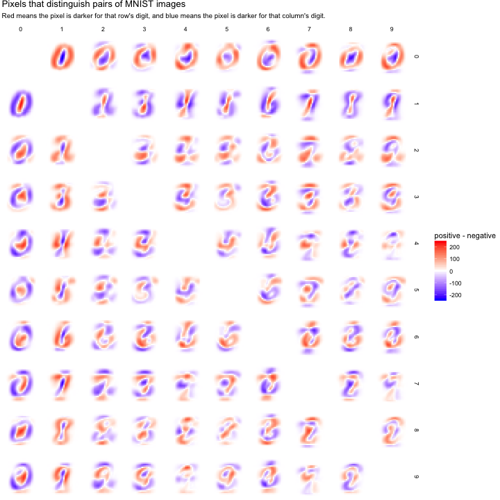
Pairs with very red or very blue regions will be easy to classify, since they describe features that divide the datasets neatly. This confirms our suspicion about 0/1 being easy to classify: it has substantial regions than are deeply red or blue.
Comparisons that are largely white may be more difficult. We can see 4/9 looks pretty challenging, which makes sense (a handwritten 4 and 9 really differ only by a small region at the top). 7/9 shows a similar challenge.
What’s next
MNIST has been so heavily studied that we’re unlikely to discover anything novel about the dataset, or to compete with the best classifiers in the field. (One paper used deep neural networks to achieve about 99.8% accuracy, which is about as well as humans perform).
But a fresh look at a classic problem is a great way to develop a case study. I’ve been exploring this dataset recently, and I’m excited by how it can be used to illustrate a tidy approach to fundamental concepts of machine learning. In the rest of this series I’d like to show how we could demonstrate how we would train classifiers such as logistic regression, decision trees, nearest neighbor, and neural networks. In each case we’ll use tidy principles to demonstrate the intuition and insight behind the algorithm.